nikhil more

nikhil more

Confusion to Clarity

Confusion to Clarity

Confusion to Clarity

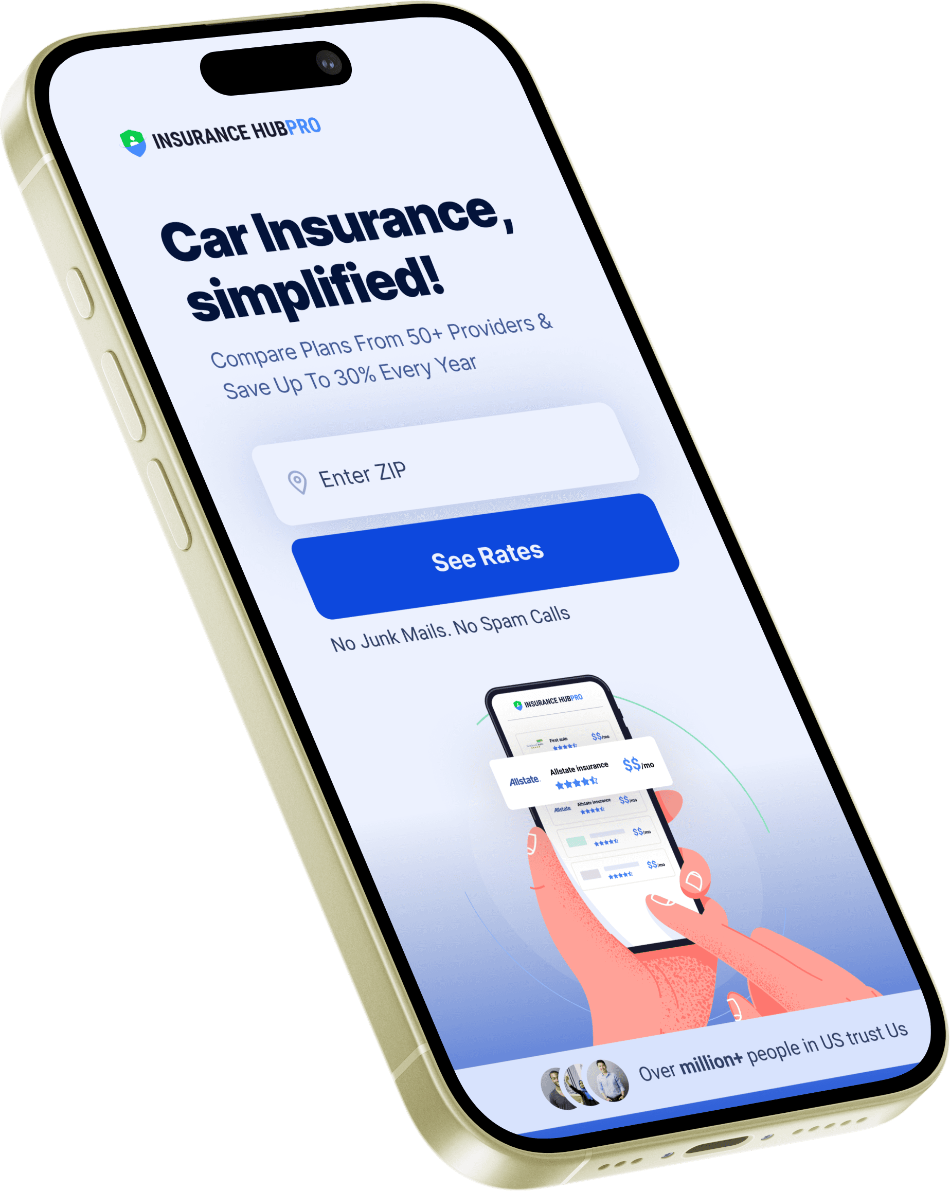
Landing page for car insurance product

Landing page for car insurance product

Landing page for car insurance product

Brief

The company required a product that gathers user information and offers them the best suitable package for their car insurance.

The company required a product that gathers user information and offers them the best suitable package for their car insurance.

My Role

Ui Design

Research

Prototype

Tools

Figma

Principle

Timeline

2 Weeks

Goal

Creating an efficient platform that fulfills user's needs by creating a hassle-free experience of selecting car insurance and making smart financial choices

Creating an efficient platform that fulfills user's needs by creating a hassle-free experience of selecting car insurance and making smart financial choices

The Process

The Process was to focus on evaluating what successful competitors (insurance companies) had been doing.

Taking user's interviews was not possible as there was time constrain.

The Process was to focus on evaluating what successful competitors (insurance companies) had been doing.

Taking user's interviews was not possible as there was time constrain.

The Process was to focus on evaluating what successful competitors (insurance companies) had been doing.

Taking user's interviews was not possible as there was time constrain.

Reasearch

Competitor Analysis

Competitor Analysis

Define

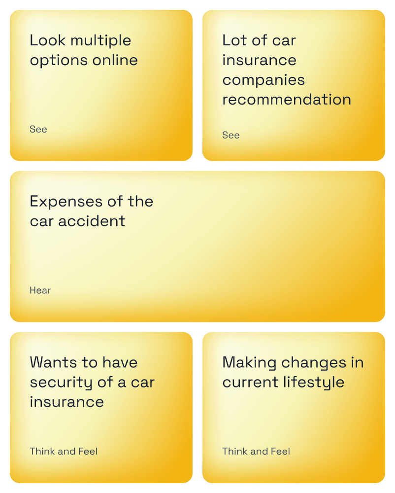
In the define phase, we had a fairly in-depth discussion with stakeholder about our thoughts on buying car insurance pain points. The Card sorting helped us to get to know user better.

In the define phase, we had a fairly in-depth discussion with stakeholder about our thoughts on buying car insurance pain points. The Card sorting helped us to get to know user better.

Ideate

In order to make it as easy as possible for visitors to compare car insurance policies and, in the best case, select insurance policies.

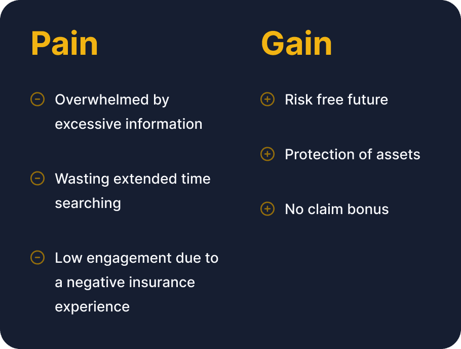
I have placed special emphasis on the mobile presentation of the website. In the right amount the important information is played in the right way and the mobile presentation does not look overloaded. Also found some of the pain and gain points to create solid research base.

Prototype and Journey

Prototype and Journey

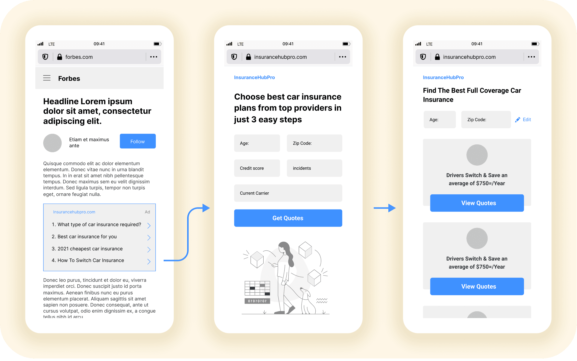
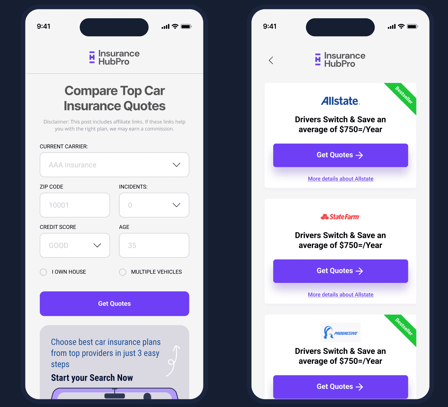
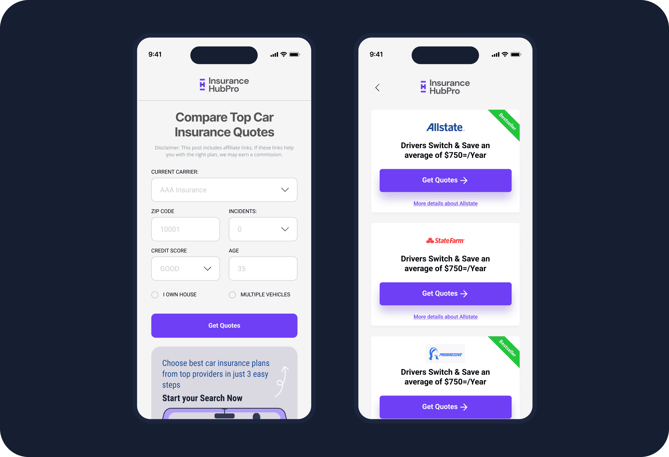
Main target group, millenials, are heavy smartphone user, it became clear that is has to be a mobile first offerring. By providing a stable and attractive mobile solution

Design

Design

Main target group, millenials, are heavy smartphone user, it became clear that is has to be a mobile first offerring. By providing a stable and attractive mobile solution

Testing

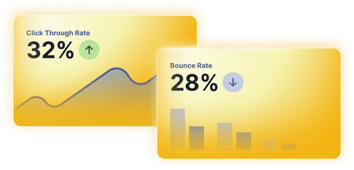
When we went live the CTR was not so good and bounce rate was higher than 65%. We decided to iterate on design and do AB test

When we went live the CTR was not so good and bounce rate was higher than 65%. We decided to iterate on design and do AB test

V2 for AB Testing

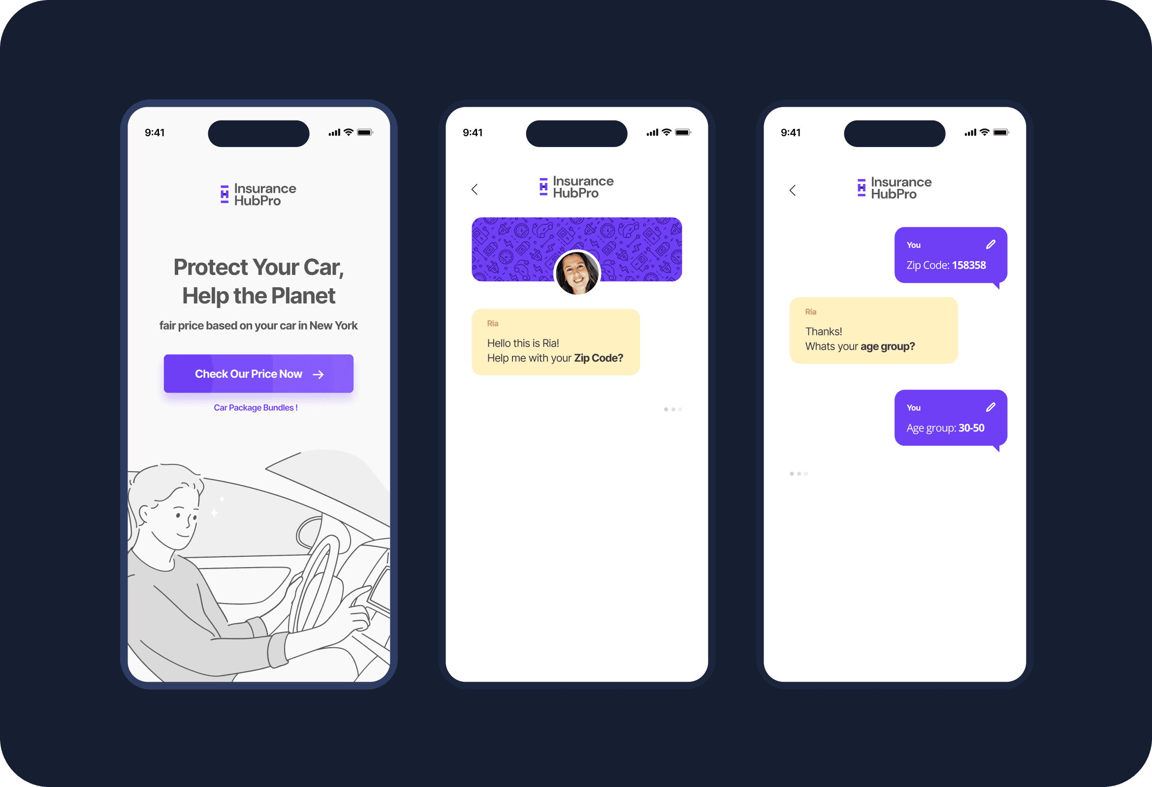
We redesigned the form by breaking it down into a chat-style format, allowing users to focus on one question at a time, reducing overwhelm. Additionally, we revamped the visuals to create a more delightful experience, aiming to engage users more effectively with the content.

We redesigned the form by breaking it down into a chat-style format, allowing users to focus on one question at a time, reducing overwhelm. Additionally, we revamped the visuals to create a more delightful experience, aiming to engage users more effectively with the content.

Key Insights from V2 A/B Testing

Recent A/B testing for Version 2 has revealed valuable insights and could see major improvements. We're continuously improving the site to enhance user experience and performance.
Let’s Turn Ideas into Something Beautiful

Let’s Turn Ideas into Something Beautiful

Join me on this journey