Designing Meahana — A Platform Built for Facilitators
Overview
Meahana is a facilitation platform designed for leaders running high-stakes strategic meetings. The goal: gather input from every participant simultaneously, surface themes using AI, and reach a concrete decision — all within a single 60-minute session.
The name is rooted in Hawaiian — mea (object, thing) + hana (work, create). Founded by experienced facilitators frustrated with disconnected tools, Meahana was built to give facilitators proper infrastructure for decisive, creative work.
I joined as the sole designer and owned the product end-to-end — from early research and information architecture through to the shipped design system and every screen in between.
Research
Before touching any UI, I spent time understanding how professional facilitators actually run sessions. The founders — experienced facilitators themselves — were the first source, but I also reviewed facilitation methodology literature and studied how competing tools (Miro, Mentimeter, Slido, Google Jamboard) approached the problem.
Three consistent pain points surfaced across every conversation:
Tool fragmentation
Facilitators were using 4–6 different tools per session. Input in one place, clustering in another, output in a third. Every handoff lost data or context.
Voice inequality
In room-based input (raised hands, verbal answers), the same 2–3 voices dominated. Quieter participants disengaged. Input was never truly representative.
Inconclusive endings
Sessions often ended without a clear decision. Themes weren't surfaced in real-time. The facilitator had to process everything afterward, scheduling a follow-up meeting.
No audit trail
There was no automatic record of who said what, what decisions were made, or what the session produced. Outcomes lived in someone's notes — or nowhere.
The facilitator's job is to create the conditions for good decisions — not to spend half their time copy-pasting between tools.
This shaped the core design principle: one platform, one session, one output. Everything from setup to documentation had to live in Meahana.
Information Architecture
The platform had to serve two very different user modes in the same session: the facilitator (building, controlling, deciding) and the participant (joining, responding, contributing). Getting the IA right meant separating these contexts cleanly while keeping the data connected.
The top-level structure resolved into three distinct areas:
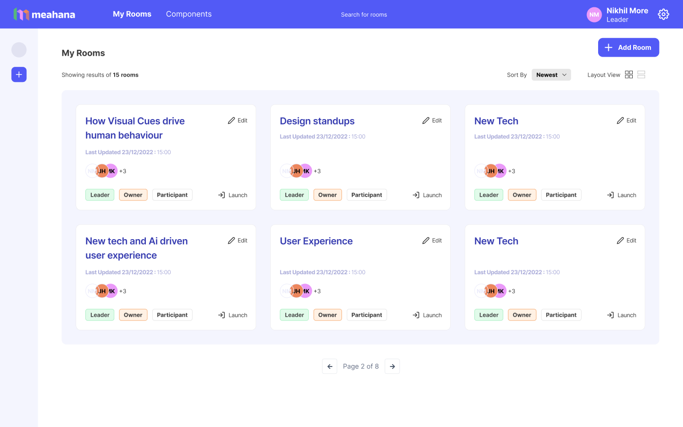
- My Rooms — the facilitator's home. All sessions, past and upcoming, with role context (Owner / Leader / Participant) and one-click launch.
- Create New Session — a 5-tab wizard: Basic Info → Media → Content → Preview → Breakout Rooms. Each tab is a distinct setup phase, progressively disclosed.
- Live Session — the facilitation runtime. A separate surface with real-time participant input, facilitator controls, and AI clustering on demand.
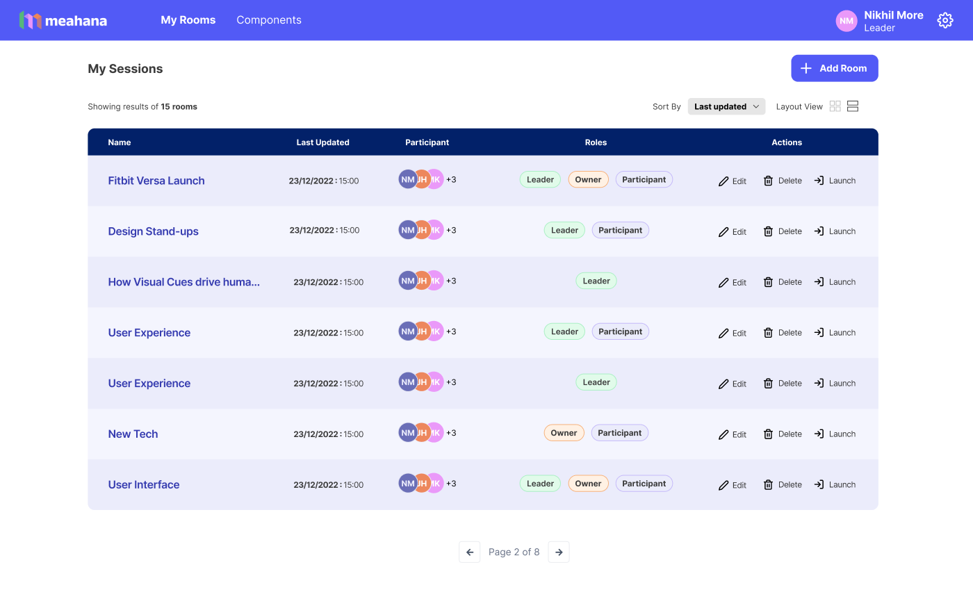
One early decision that shaped everything: rooms vs sessions. A Room is a recurring context (like "Q1 Strategy" or "Design Standup") — a Session is one instance within it. This hierarchy let facilitators reuse structure without rebuilding from scratch every time.
Why two views (grid + list)? Facilitators who run many rooms scan by name and visual identity — the card grid works for them. Facilitators who manage permissions and participant counts need the density of the table view. Both views persist user preference across sessions.
Session Builder
The session builder was the product's most complex surface. It had to handle 5 distinct setup phases — room basics, media assets, activity content, preview, and breakout configuration — without overwhelming a first-time facilitator or slowing down a power user.
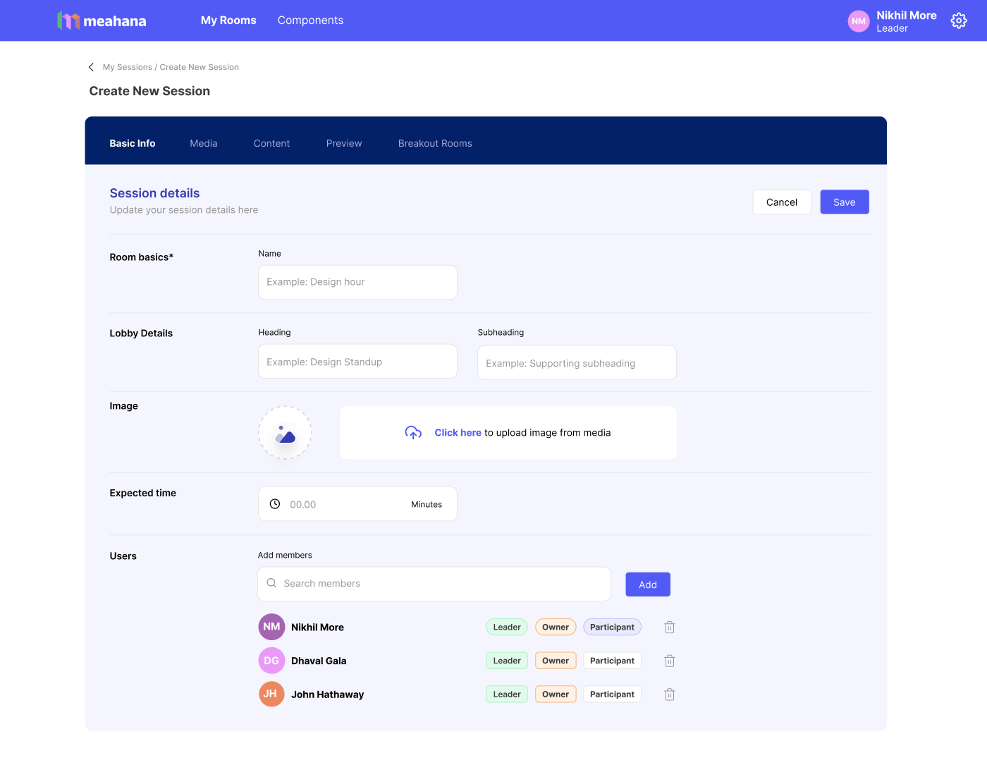
The solution was a progressive tab system with clear phase labels. Each tab is self-contained — you can save and come back. The active tab highlights, incomplete tabs are visually distinct, and navigation between tabs never loses entered data.
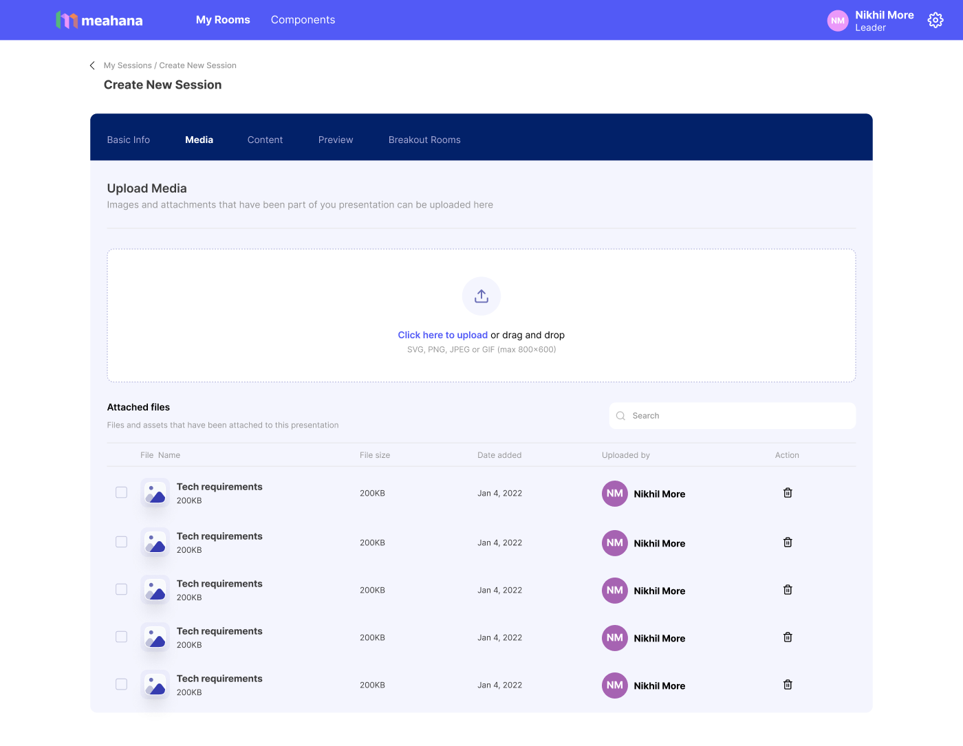
A facilitator building a session three days before the meeting shouldn't have to rebuild it the morning of. The builder was designed around save-and-return, not submit-and-done.
Role assignment at setup: Adding team members with Leader / Owner / Participant roles during session creation (not just at launch) meant permissions were already resolved before the room opened. No last-minute role confusion mid-session.
Media tab separation: Keeping assets (slides, images) in their own tab, separate from content (activity questions), prevented the most common confusion we saw in research — facilitators accidentally overwriting activity content with their slide decks.
Live Session
The live session view was the beating heart of the product. This is where everything the facilitator built gets used — and where participants actually experience Meahana.
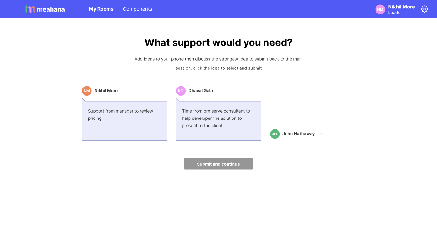
Participants join by scanning a QR code — no app, no account. They see one question at a time on their phone and type a response. All inputs arrive simultaneously. The facilitator sees them populate in real-time on the main view.
- Every participant submits at the same time — no one waits for the microphone
- The facilitator controls the pace — revealing inputs, moving to the next activity, triggering AI clustering
- Responses are attributed to participants, creating a complete audit trail automatically
The participant view was designed with radical simplicity: one prompt, one input, one submit. The cognitive load was deliberately zero — participants stay focused on thinking, not navigating.
Why show participant names on inputs? Anonymity was considered, but facilitators needed attribution for the AI clustering audit trail and for follow-up conversations. Named inputs also increased accountability and response quality in sessions. This was validated in founder interviews before the screen was built.
Reflection
Designing Meahana end-to-end was one of the most demanding — and most rewarding — design projects I've worked on. The complexity wasn't visual. It was systemic: multiple user roles, multiple device contexts, real-time data, and a facilitator who is cognitively at full capacity during a live session.
Every design decision had to answer: does this reduce cognitive load for a facilitator running a room?
- Owned the entire design process solo: user research, IA, flows, component system, and all shipped screens
- Designed across three distinct surfaces: facilitator dashboard, session builder, live facilitation view, and mobile participant input
- Built the component library from scratch — covering 19 activity types without visual fragmentation
- Worked directly with founders to translate facilitation domain knowledge into product decisions
- Every architectural decision (rooms vs sessions, tab-based builder, named inputs) came from research — not assumption
The biggest lesson: when you're designing for domain experts in high-pressure situations, trust their expertise. My job wasn't to reimagine facilitation — it was to remove every obstacle between their intent and the outcome their participants needed.

